Pages

Thursday, January 4, 2024

2023 Part 1: Gesture

I'm going to post some of the work I did in 2023, and I'm going to try and show the good, the bad, and the ugly (as well as all the fucking work it takes!) as per my original mission. We'll start with gesture:

From August, I think

Not timed, about October sometime. Ads and models are good reference for clothes and also interesting poses!

This and the above were from last month. Timed. As we go the times got longer.

2024

 2024 is going to be the year of posting! 2023 was crazy for me, but I did promise to myself to practice more every day, and started tracking how much I drew. I didn't get all the way there, but I got farther than I would have otherwise, so that's a win. 2024 I'm challenging myself to do at least one finished digital piece a month. Hopefully I can get in the habit of doing this.


This one's pretty good. I wanted to start with something simple and work my way up, but it still ended up taking somewhere between 6 and 8 hours--mostly because I'm still figuring out how I like to render. Anatomy is pretty good, but some takeaways:

  • I didn't know how to do sheer materials like stockings and eventually just decided I needed to move on. I should study this.
  • I'm not great with faces
  • Using the pencil brush for inking is fine for inking, but it kind of screws you over when doing fills, since it's not super dense. Zooming in this is very messy.
  • I'd like to have better shape design for light and shadow. I find it's hard to do that with the brushes I've been using.

Saturday, April 15, 2023

4/15/23 update

Getting back into it. I scrolled through my digital sketches a little and realized 1. I could be making a lot more finished artwork with how good I've gotten, and 2. I have a lot of stuff that I could show off. I'm not going to do that all just now, so here's a sketch and a study.

From August 22. This guy looks cool. Well done past me.

From December 22. You don't wanna know what the layers look like for the one on the right.

V

Saturday, November 5, 2022

Inktober 2022

 Inktober 2022! A good exercise. Special thanks to my fellow artists for inspiring me to push through--Godiva Ghoul in particular. Her art is amazing and really influenced a lot of the style for these pieces.


The first one here is a huge milestone. This is a character designed after InCase's incredible "The Invitation" comic, which is what got me started on this journey in the first place. Being able to recreate a similar design and feel like it looks finished and professional really makes me feel like I've come a long way.

#2, #3, and #5 are studies of the models Morgana Stone, nano_nano, and Emily Yunicorn.

Note there were a ton of these I did that were pretty bad, so I don't feel like showing them. Sorry!

Thursday, August 18, 2022

Himbo Cumbrain


Whoo! Another one.

Looking back on my work I can tell that when I'm not holding myself to a certain standard or schedule, I let my practice slip. So here I wanted to make something, and I wanted to ensure the work was as easy as possible. I knew that for this one I needed a clear goal in mind, inspiration, and reference. If I let myself sketch around a lot, I get sidetracked and start floundering, so with this approach I was able to go right from sketch to inks to flats etc.

As I keep working on these, I can tell that I basically have no idea what I'm doing when it comes to rendering. I can pick colors fine, I know the theory and how to put it into practice, but when it comes to developing a piece past flats I get lost. I particularly want to study from artists like InCase, ittla, D8, and rhabarberei/Maren.

Here's a quick sketch I did. I wanted to see how fast I could go from sketch to flats (like about 1.5h, for those who are wondering). It's ok. A little more graphic than I usually do. Didn't realize until after the fact the design is very similar to my "Gender" piece. Really happy with how subtle I was able to make the colors--IIRC the hair is on the blue side of grey but reads as kind of warm because of how the other colors communicate.

Again, got to get some sketches/sketchbook stuff on here.

Sunday, August 14, 2022

Gender


Motivated by some @itttla works to actually make something for once. Probably took 2h total. Really pleased with basically everything here, from design to gesture to hands even.
While I'm constantly growing and practicing, I'm not actually making finished work. Unfortunately I've learned that without that structure to keep me honest, I don't make consistent finished work or even consistently study/sketch and get distracted. There have been months where I've rarely drawn. Drawed? Drew?

The most important thing I learned with this one is that I have to walk before I can run. Backgrounds are cool and IMO really make a finished piece, but if I try to do everything at once I'll end up with nothing at all.

The second most important thing was that I found an inking brush/method that feels good and has a texture I'm happy with.

I'll see if I can scrounge up some sketchbook photos or other studies I've done since my last dump and post them here. Better yet, I should make a habit out of it.

Sunday, September 12, 2021

Moonlight Ghost Twink


This one was very silly and self-indulgent but a lot of fun. As I was finishing up I used the sparkle brush on a whim and it fit incredibly well.

So I wanted to do a pinup of a man, and I really love this piece by Sabs. I also was interested in trying out the new process InCase has been talking about. Basically, you color beneath a cleaned-up sketch, and once you get to a certain point, you merge the layers together, paint on that, and then add in the linework on top. I think that was actually pretty good, but I'm not yet good enough at painting to make it work really well.
 
I also sketched this out on paper a couple of times before taking a picture, putting it in Clip Studio, modifying that sketch, and starting on top of that. I think that worked great.

Takeaways from this piece:
  • A lot of the anatomy here is fudged, particularly the pelvis and chest. Surprisingly, the hands and feet are OK. Very happy with the legs.
  • When starting to paint, throw in some hue variation. The colors get cooler as you go down the figure, which I think worked out well here.
  • Rim lighting as your primary light source makes your life very difficult because it puts the rest of your subject in shadow, forcing you to eliminate detail. I found that too difficult so I ended up lighting the figure from in front slightly as well.
  • I can't draw non-twink male bodies. This guy isn't just a twink, he's exceptionally skinny. I think he's drawn pretty well, but I need to practice other types of bodies.
  • This one makes me so mad: I accidentally set the canvas size to 2000x2000 when sketching and forgot to change it back. This makes all the small details have little jagged edges and there's really no simple fix for this as far as I know. Grrr!
  • For whatever reason, I have a lot of trouble drawing pecs unless they're front-on and fairly muscular. This makes the ribcage look flat instead of curved.
  • Rendering! AGHHHH! It's fun but hard! I want to focus more on a more graphic style for now.

I was flipping through my sketchbook yesterday and was struck by how good my drawings were when I was doing more serious studying instead of focusing on making finished illustrations. I think I'll take the next few months off from trying to do these weekly paintings and study instead.

Wednesday, September 8, 2021

Busy

 Couldn't get anything done this week. Maybe some sketches/studies up before the next piece.

Saturday, August 28, 2021

Wouldn't You Be Warmer Next To Me?


There is a small percentage of you who went "Wait, what the fuck?" after seeing this image. I will explain.

This week I wanted to focus on painting. I've been really stunned by the art of Humankind and recently watched a video on their process. Really interesting, but to emulate this I would have to learn 3D. I don't know 3D.

So, long story short, this is a paintover of a Skyrim screenshot, with some potentially-familiar props in the background. I installed some pose mods and set this up. An interesting workflow, but it has some pretty significant drawbacks, namely:

  • The Skyrim engine makes composing a scene really hard. I originally wanted to set up a sex scene, but the NPC kept wandering off and I decided to make do. Wrangling the engine wasn't what I wanted to practice. There were some automatic headtracking issues as well.
  • Even with high-quality graphics mods, the colors are fairly muddy and low-contrast (excuses, excuses...)
  • Skyrim characters are inhuman abominations with broken skeletons and weird proportions--specifically, their heads are fairly small.

That said, this was the easiest time I've had drawing hands in my life. I also had success with painting (both the character and the background). The 3D reference helped with that, sure, but so did my increasing skill. Very happy with that.

I'm surprised I ended up liking almost completely black lineart--I usually go in and color it, blending it in a little--but the head popped SO much more when I hid that layer, so I toned it down a bunch.

All told, this took about 6 hours. For a piece with a background (admittedly, not inked or detailed, then blurred) that's not bad, but it's way above a professional pace. I also made a promise to myself to not abuse the undo key while inking, so that part took 3x faster. Once I forced myself to take my time and go slow, I was a lot more accurate and controlled. Next week I hope to practice faces--I feel my style slipping a bit, and InCase posted today after a long absence, so I feel pretty inspired. I've noticed most of my recent pieces all have the subject with their mouth open slightly, which is a little sexy but also a little 👁👄👁

Sunday, August 22, 2021

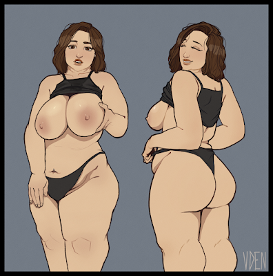
Thick Lady


Experimented with an even simpler coloring style. Did both of these in like 6 hours, which is a lot faster than the previous one. Still not fast enough to do comics, though that'll come with practice. 

The biggest and most important part of my process here was reference. I used two primary reference photos--one by nnnneko666 and one by bunnyrhodes--though I ended up using many more. You can see how useful it was...all hands but the leftmost were drawn with reference and you can see how bad it is compared to the others. Finding good reference is hard, but it's absolutely necessary unless you're a pro at inventing anatomy.

Takeaways/self-crit:

  • The boobs on the left are too huge! I think this came from combining two disparate pieces of reference. I thought it was good until I finished it and came back.
  • My linework is still garbage. Every line I make I crtl-Z it like 5 times or more. This is an awful habit and one I should get to work breaking immediately.
  • Fat is hard to draw! It doesn't connect to bone and muscle in a way I'm used to. This was good practice.

Fat girls, if you're reading this I want you to know that the little hint of tummy that shows on the outside of high leg panties/other lingerie makes me go awooga like a 1950s cartoon character. That's all.

Sunday, August 15, 2021

Gym Babe

Jokes aside, here's the illustration. It's pretty good.


Wanted to practice coloring, instead did the best secondary forearm anatomy of my life. Everything I wanted came across, from the pose to the mild look of distaste on the subject's face. Why am I like this?

This took about 7-8 hours over the course of an entire weekend. I didn't push myself too hard, thankfully, and had fun. Some takeaways:

  • Flat colors are very cool and good, but my shape and line control leaves a lot to be desired. It's pretty messy. The core shadow-subsurface scattering technique is pretty useful. Will I ever study rendering? Yes. But right now, I'm having a lot of success with this technique, which is easy and convenient.
  • Use reference 100% of the time.
  • My composition is weak and I end up using tricks like vignetting and blur to prop it up.
  • Next time I want to study color, do the following two things to make sure I'm not unfocused:
    • Copy from a better artist. I can learn to invent color when I understand it better.
    • DON'T WASTE TIME ON BACKGROUNDS YOU FOOL!

I'm happy I can make stuff that looks good at this point! I'd like to push for 1 finished illustration per weekend but who knows if I can keep that pace up.

Sunday, May 23, 2021

Shower


After the last piece I decided I wanted to give another go at flat colors. Turns out--they're great. This slaps and I feel so POWERFUL!!! AHHHHH!!!

This is heavily inspired by the work of @rhabarberei, specifically a Tifa/Aerith image set she did. For my money, Maren is the best wlw artist on Twitter, and the way she uses flat colors is gorgeous. Go check out her work! Again, it's a really incredible style, but I think I should do painting studies with it before I try another full image this way.

This took about 11 hours total because I was constantly figuring things out and trying new things. I really wore myself out with this one because I did the whole thing in a single day--I worked from about 8 to 4 last night, and then finished it from like noon to 3 today. I need to figure out a way to not get carried away painting because that's a really fucked up work schedule and I'm concerned for my eyes, my wrist, and my sleep.

Wednesday, May 19, 2021

Dancer


 This was the first piece where I actually felt like the painting was coming together. Originally I wanted it to just be flats. Oh well, I'm a fool. Important things I did here:

  • Really push the line color in certain areas. The lines around her hip start to even blend in to the skin, and many inks around the background light are actually just really saturated, light colors. Worked out well--much better if I left them all black.
  • Really incorporate bounce light. On the edges of her body and leotard it's super saturated. It looks good and really puts her in the scene (though there's not much of a scene to begin with)
  • Break down light and shadow into shapes. This one's really hard, as you have to imagine how light works, and I only really succeeded with her skin. But, for example, look at her hand...light from below is coming up to define the form. Same with the face, hips, and tail (kind of).
  • Think about color not as an inherent aspect of an object but instead a way that light interacts with it. This is kind of tricky to think about, but in this piece, everything is basically a different shade of purple. The leotard isn't white, it's a purply-bluish-grey (IIRC) but it reads as white. The skin is basically pink, and the latex is a dark purple. But because of the light, all these things look more natural than if they were white, beige, and black, respectively.
  • Use reference, especially for the latex. Man materials are hard.

 As always, my anatomy needs to be better. For my next painting, I want to focus on improving light and shadow shapes as well as using a smaller inking brush. I think my inks are nearly always too big and dominant for the style I'm trying to achieve.

Again, I'm really happy with this, and I think it's a culmination of all the painting practice I've done. It was always frustrating for me to hear this, but practice and study are really the only things that matter. Trust me, do like, fucking still lifes, set them up next to your desk and paint from observation. Do exercises where you break things up into just lights and darks and then practice blending them. Look at artists you like and see if you can replicate their painting style, then reflect on why you weren't able to. As always, ctrl-paint is an excellent resource. Going on picarto to watch streams of artists you like has been very valuable for me as well.